1/10

2/10

3/10

4/10

5/10

6/10

7/10

8/10

9/10

10/10
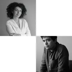
Author(s) / Team representatives
Lazar Andrei, Madalina Rusen
Profession
ARCHITECTURE
Collective/office
STUDIO MORFONOVEL
Project location
Romania, Bucharest
Budget in euros
-
Usable area
300 sqm
Project start date
September 2022
Construction completion date
October 2023
Photo credits
Vlad Eftenie
Text presentation of the author/office in English
Studio Morfonovel was founded in 2021 in Bucharest by Andrei Lazăr (architect) and Mădălina Rusen (urban planner).
Our practice spans from the urban scale to the architectural and object-oriented design, emphasizing a systemic and integrated approach to planning urban areas, with equal consideration to the intricate details that connect people, spaces and buildings.
The complexity of the context is seen as an endless source of inspiration, therefore the adequate integration of our projects within each specific context is instrumental for design and implementation. We focus on tailor-made solutions, constantly looking to accumulate knowledge in urban planning, materials and manufacturing processes, so that the technique does not represent an purpose in itself but neither an impediment.
This studio is dedicated in developing projects that improve the visual identity of companies and enhance the quality and lifestyle of individuals, with a particular focus on user experience, going beyond merely meeting basic needs. The name represents an aspiration and embodies an inclination for research, exploration and finding new forms.
Project description in English
The project aimed to create a unique visual identity for Tapastick, seamlessly integrating it within Bucharest's foodscape. Steering clear of current design trends, we transformed the previously fragmented space into a cohesive whole, laying the foundation for an ever-evolving culinary platform.
By securing the perimeter and ensuring it met modern standards, we collaboratively exposed the building's structure, creating a white 'frame' that provides a clear base for our design approach, tailored to the given function.
From the street, the entrance has a discreet presence, blending into the surroundings, not adding much to the already busy neighborhood. However, for those seeking an escape from the urban bustle, the entrance doors become a welcoming sight.
Upon entering, a trapezoidal passage opens into a central courtyard and once inside, the reversed perspective minimizes street presence. The former messy courtyard was transformed with a simple concrete/stone floor and restored facades.
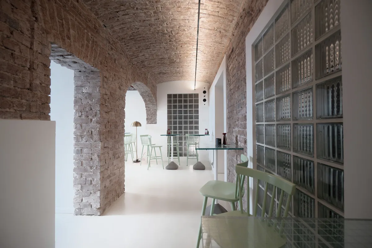
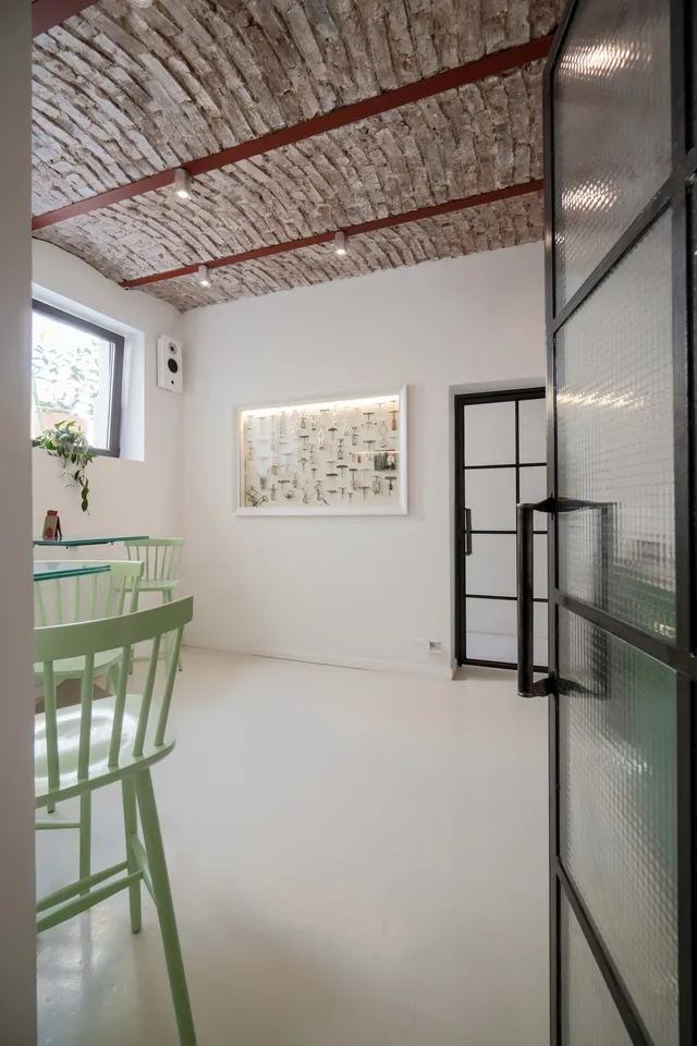
The existing well-organized interior space, accessed from the courtyard, uses mirrors on far-side walls to enlarge the perception of space. The interior walls were stripped down to the bricks, revealing the space’s raw character. This established a clear layout for our intervention, allowing a big part of the final design to emerge organically through a collaborative, on-site process.
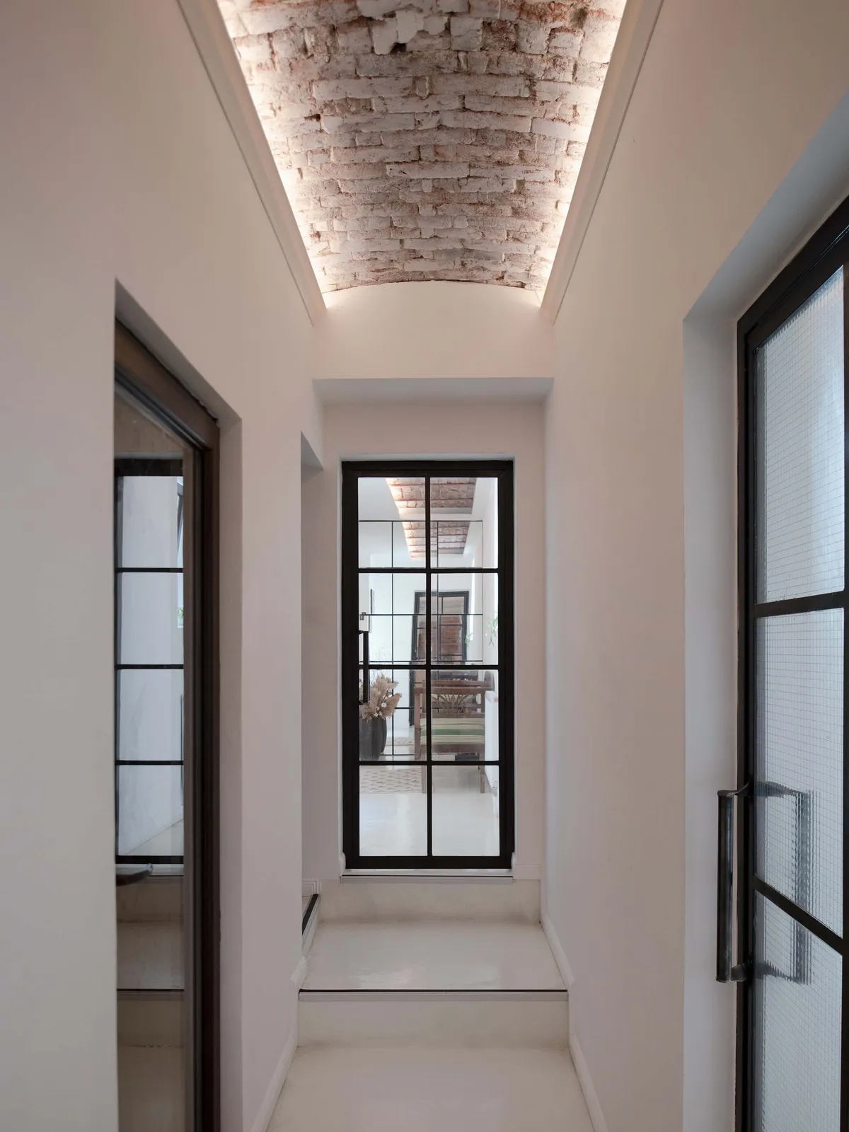
Preserving the historic ceilings posed a lighting challenge. Our solution for the main corridor, featuring a single-span cylindrical vault, involved a stretched wire illuminating the vault from above.
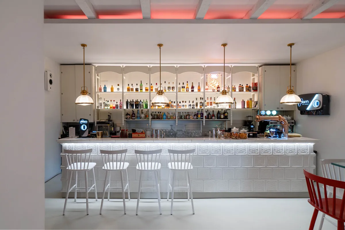
The centerpiece of the space is undoubtedly the bar, which serves as the central link between the proposed layout and the historic building. This custom-designed unit was planned closely with bartenders, prioritizing functionality and ergonomics to perfectly meet their needs.
The idea of using stove tiles was inspired by the building’s former heating system. While we initially explored reusing some of the original tiles, we ultimately collaborated with a manufacturer specialized in artisanal tiles to create the elements for the bar.
Thick glass tables were scattered throughout the space to maintain a sense of airiness, while the printed grid is reminiscent of a picnic blanket that adds a touch of whimsy to the space.
