Interior Space

Interior Design

0

votes of the public

0

votes of the public

storiz studio

Author(s) / Team representatives

storiz studio

Profession

architect, interior designer

Co-authors/team members

Katalin Imre, Blanka Zvolenszki

Project location

Budapest, Hungary

Budget in euros

NA

Usable area

175 sqm

Project start date

March 2022

Construction completion date

June 2023

Client

Metrodom

Website

See Website

Photo credits

Norbert Juhász

Text presentation of the author/office in English

storiz is a interdiscipline studio of Katalin Imre and Blanka Zvolenszki, based in Budapest, Hungary. We met and became friends at the Budapest University of Technology and Economics where we graduated in architecture in 2014 and this is where our story began. As a small team we can provide a client centered and effective, personalized service. Our main profile is interior design mixed with architecture and graphic design in between. In our portfolio you can find tiny studio apartment, luxury residence but also a many hundreds sqm office interiors or residential common areas with service design. We love to lead and follow our projects from the very first steps and drafts till the final touches - design concept and preliminary plans, official construction administration procedures, construction plans and furniture plans, signage design, building site technical management, even the staging for the photoshoots.

Project description in English

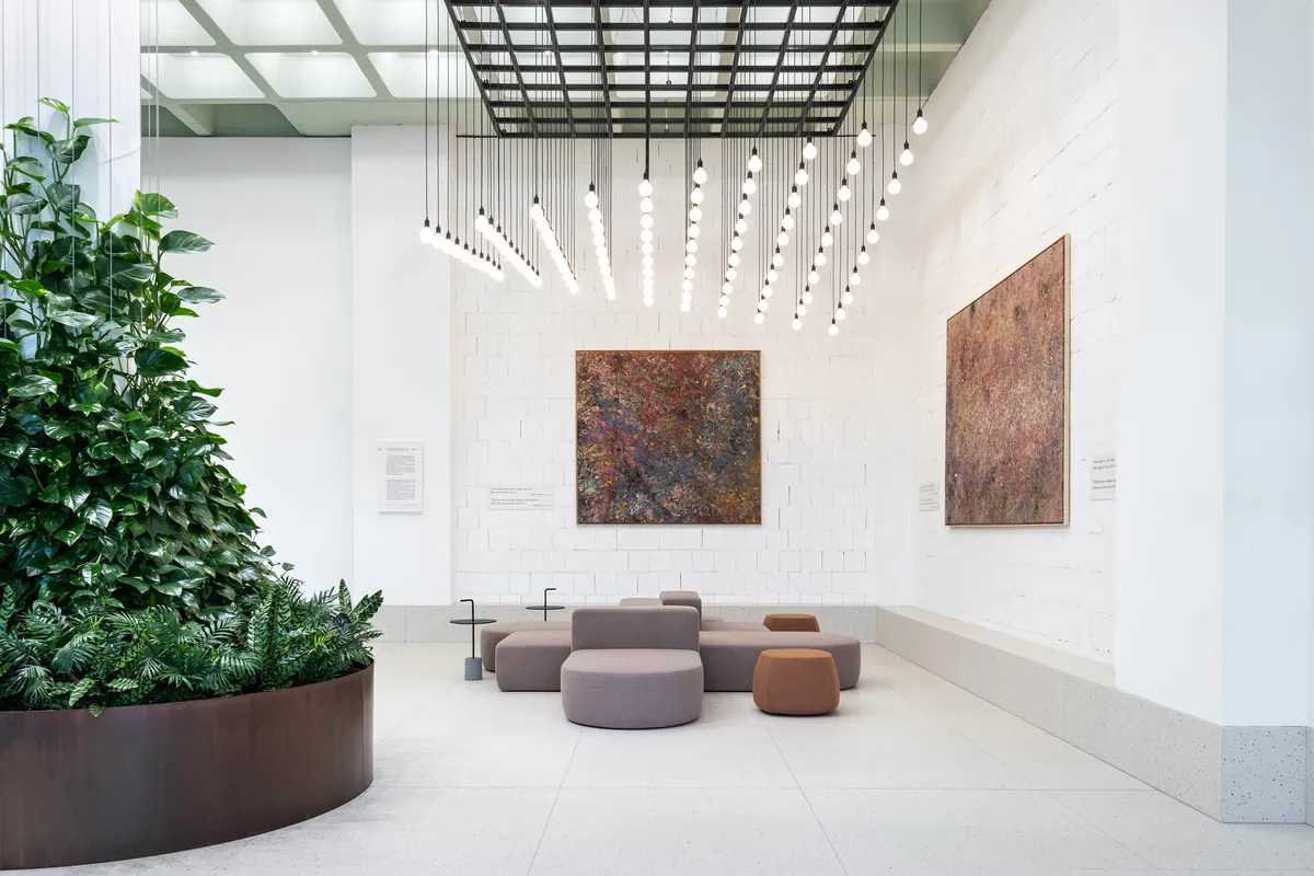
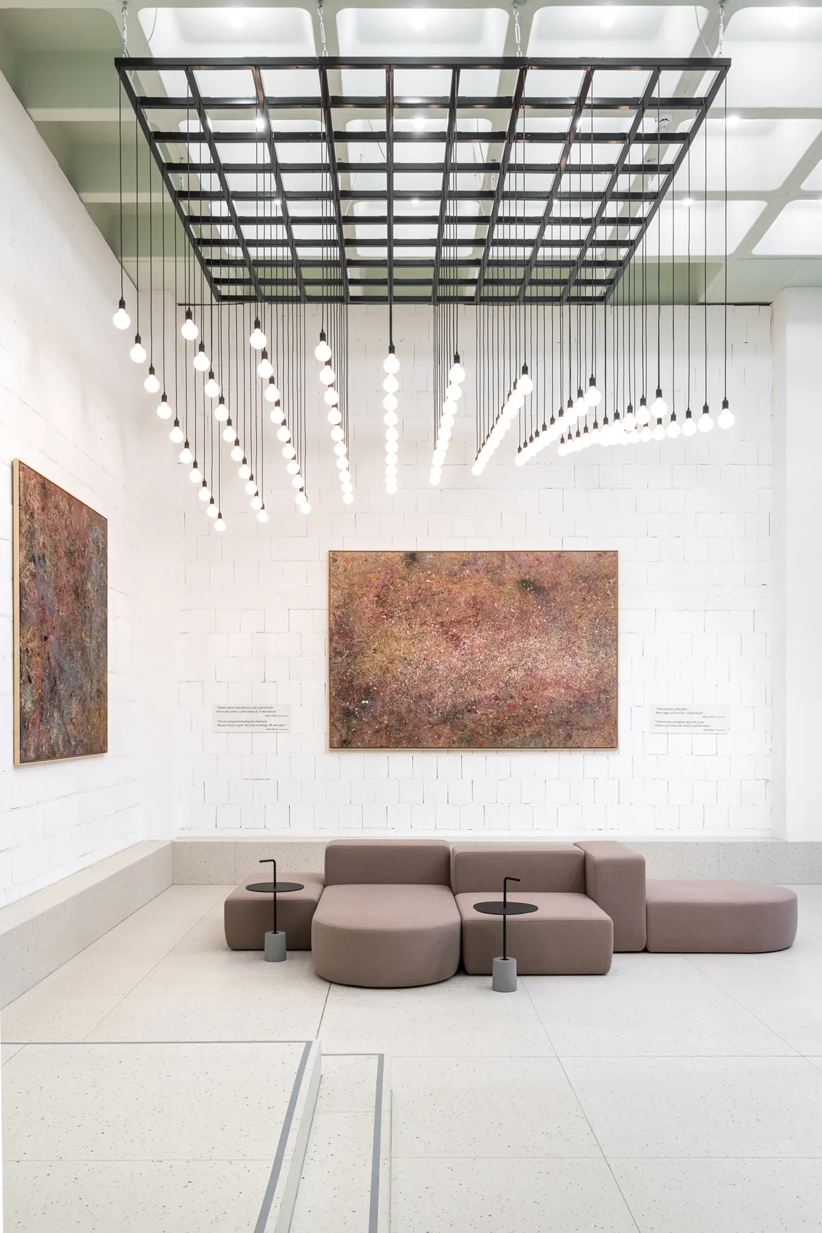
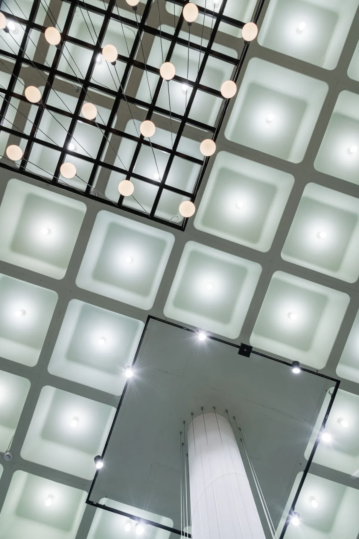
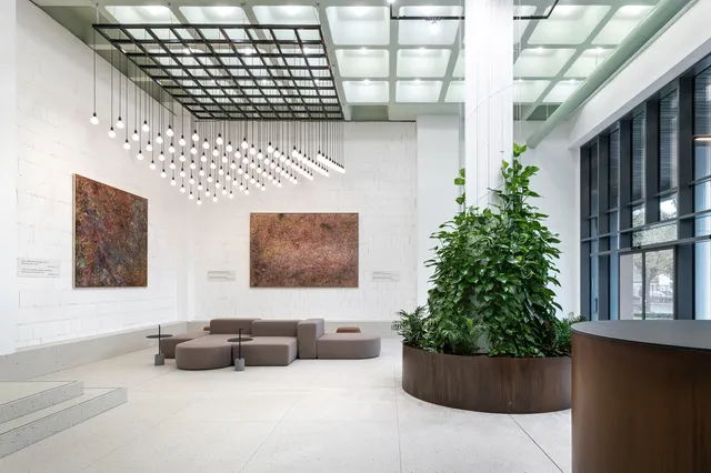
The Metrodom real estate developer is forming a headquarter for itself by remodeling an existing, industrial building. We got the commision to design its main lobby’s interior as functionally as in design aesthetics aspects. In the interior design concept we wanted to emphasize the sustainable and conscious approach of modernizing an existing building while also subtly displaying the branding of the company. The main interior design features for aiming this: (1) not covering but highlighting the exciting reinforced concrete beamed structure of the ceiling by a pastel green painting without any plaster and the grid of this structure is reflected by the floor covering (2) attractive suspended lighting installation following the grid of the beamed structure then evolving into an organic 3D shape in the two story height space (3) on some brick wall surfaces we skipped plaster as well, showing building material textures in its natural glory and putting them in a reinterpreted position as the background for gallery walls (4) the use of structural materials in furniture design, such as corten steel covering of the reception desk and oversized planter and highlighted refractory coating on exposed pillars. The main attraction of the lobby space is the lounge area opposite the entrance, which we emphasized with the lighting installation placed above it. The reception was placed in a more protected, lateral position, so it was closer to the reception rest room.