Interior Space

Interior Design

S

Selected

0

votes of the public

0

votes of the public

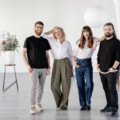
arh. Alina Filipoiu, arh. Anca Dumitrescu, arh. Bianca Abacioaei, arh. Alice Straton, arh. Ina Stamate

Author(s) / Team representatives

arh. Alina Filipoiu, arh. Anca Dumitrescu, arh. Bianca Abacioaei, arh. Alice Straton, arh. Ina Stamate

Profession

Arhitect

Collective/office

441 Design Powerhouse

Co-authors/team members

arh. Octavian Cazacu.

External collaborators

Space Lighting

Project location

Meron Cișmigiu, Bucharest, Romania Bulevardul Regina Elisabeta 40

Budget in euros

90 000 euro

Usable area

102 mp

Project start date

June 2023

Construction completion date

September 2023

Client

Client Meron Roastery SRL

Photo credits

Sabin Prodan
Text presentation of the author/office in English

Passion is the signature of the 441 Design Powerhouse studio. Their honesty, respect and creative world view are imprinted in each project they take on. Emotions and functionality are equally important in the creative process and in designs that turn imagination into reality. They are constantly exploring the world to find ideas that do good. For them, design is a lifestyle. They feed on it, hear it, breathe it, see it, feel it, and use all these experiences to bring harmony and beauty to the surface in an ever-changing universe. Whether we are talking about corporate, graphic, interior design, branding, 3D & animation, video production or UX/UI, the 441 practice is based on the same principles. It always prioritizes brave, custom-made ideas, authentic and relevant solutions, which give both shape and substance to each project’s aspirations. They perceive design as a form of expression, art, solution to challenges. They know it has the power to make every place better, more accessible and more sustainable. "Love at first sight" refers to both what is seen and what is felt, the result of numerous processes, flows and steps that they follow. That's why the first connection is as important to them as the long-term relationship with the stories they create for their clients.

Project description in English

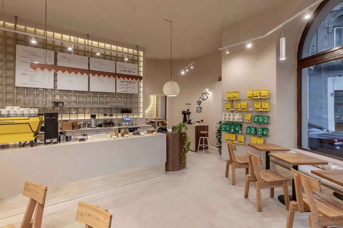
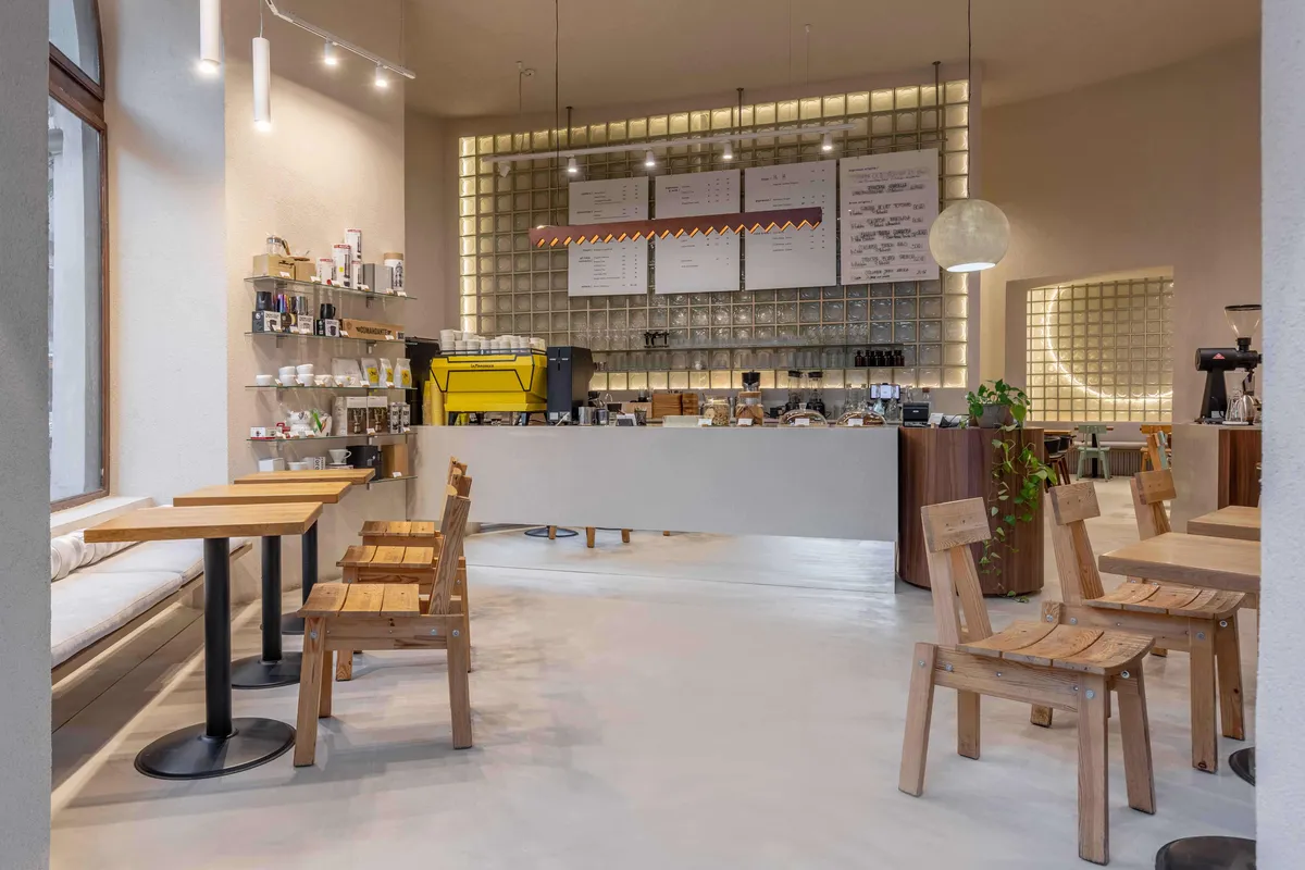
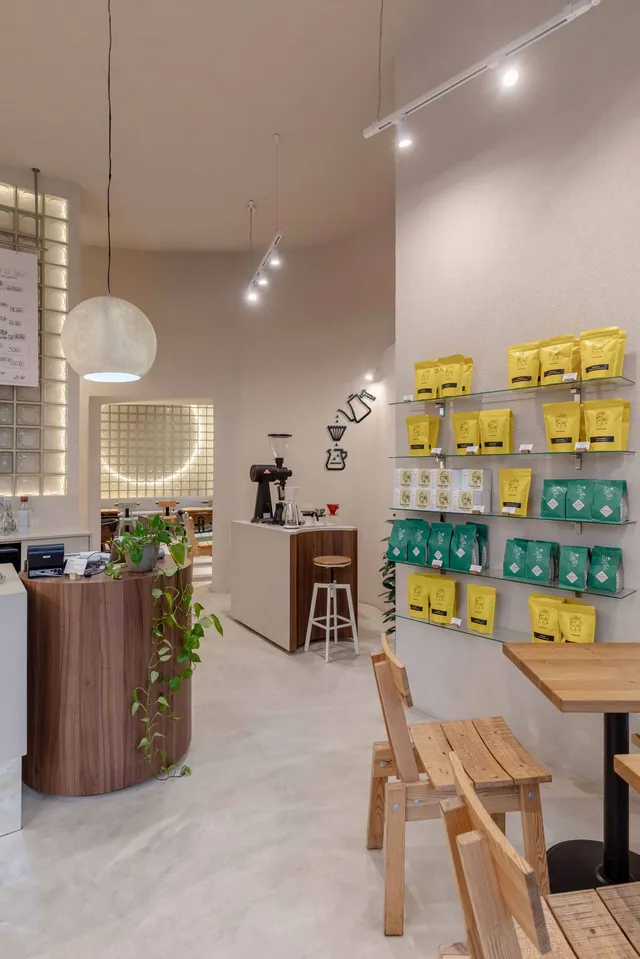
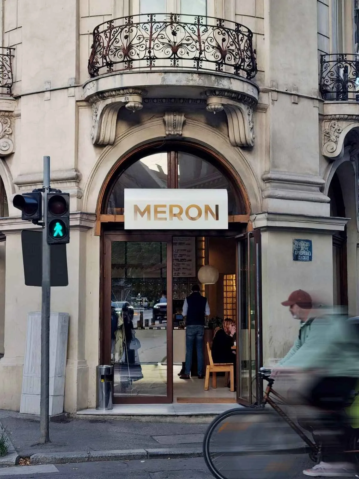
The 441 Design Powerhouse team gave a new stylistic direction to the Meron brand based on simplicity and uniformity. The change is already visible from the outside at the level of the new lightbox of the Meron logo which, thanks to the new design, is simple and contemporary, complements the interwar building, and does not distract from its architecture. The two spaces of the cafe were unified by common stylistic notes that go from the rough finishes of the walls and ceiling or the fine ones of the glass brick to the mirrors or furniture. The suggestive power of natural materials is the backbone of the arrangement and is visible from the first space, which is also the access area to the cafe. Here we have the cylinder-shaped house area accompanied by a spherical lighting fixture that it becomes the sister of the volume with curved cutouts of the brew bar area, both of which are dressed in one walnut veneer finish that contrasts with the rest of the warm and neutral tones.